Sometimes, it is useful to be able to look at a specific time period for a statistic. To see this, you may need to extend the graph to a longer period of time. Or, you may want to look only at the trend of a specific three month period. This help article will show you how you can customize the time period that your graph is displayed in.
Start at "More" and then "Date Ranges".

Click "Create New" to make a new custom time period.

For this example, let's say that my company is launching a new advertising campaign that will run for 4 months and I know I'm going to want to view sales during this period regularly. It's best to set a custom time period so I can simply use that setting each time, rather than have to alter the dates each time I go to the graphing page.
Name the time period, set the start and and dates, decide whether only you will be using this time period or if others in the company should be able to use it too, and save.

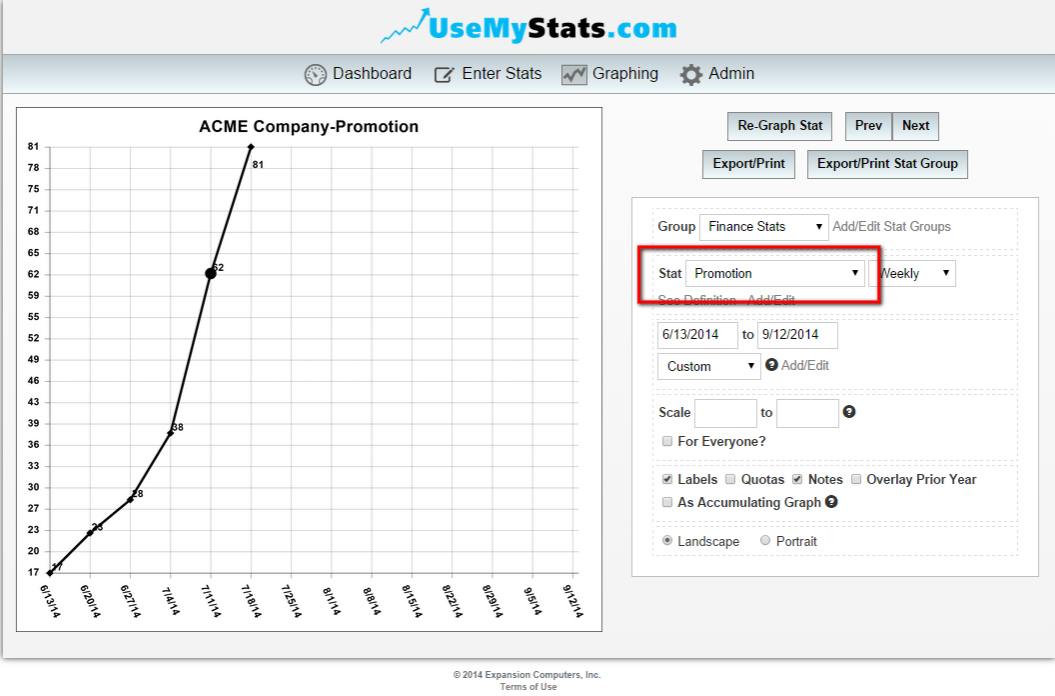
After returning to the graphing area, the custom period you created will now be available in the drop down box.
Choose the custom time period and the graph will be updated to reflect those dates.

You can also adjust them manually using the date boxes below the drop down boxes. Those adjustments will display on the graph as long as you are on this page. If you leave and return, you will need to set those dates again.
Using these tools, you'll always be able to view a custom time period of your graphs!