You may find that you want to quickly compare how two statistics are doing. You could go back and forth from one graph to another, with the value scale changing and making it confusing. OR, you could use the overlaid graphs feature.
Once you log in, go to "Graphing" then "Graph Multiple Stats".

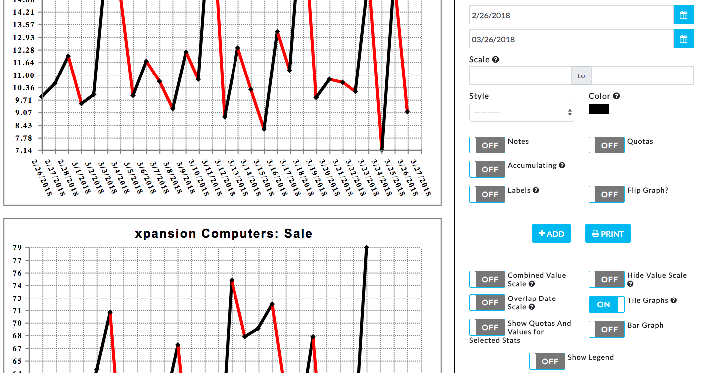
It will open as a blank page that looks like this:

Use the group drop down box to narrow down the list of stats to select. You then have the following options before adding the stat to the graph:
1. Time Period: Custom time periods will graph based on standard periods of time such as weekly, monthly, quarterly, annual, etc. This is not how long of a period shows up on the graph from start to finish, it's how much time is in between each dot on the graph. Selecting a daily statistic and changing the Time Period to Monthly will add up each day for the month and plot a new dot.
2. Date Range: This is the length of time from the beginning of the graph to the end. What is the date the first line should be graphed for and what is the date the last line should be graphed for?
3. Scale: This is the range from the bottom of the graph to the top of the graph. We automatically scale each graph for you to best represent the values during the dates you've selected, but if you need to override our automatic scaling, you can.
4. Color: Default coloring is red for down and black for up. Because it can sometimes be confusing to have more than one line on a single graph, you can change that default here.
5. Style: If you prefer to change the appearance of the lines while retaining the red and black coloring, you can do that here.
6. Notes/Quotas/Labels: Do you want the above to display on the graph? If so, check the box.
7. Accumulating: Rather than graphing the value entered to each time period, such as (2, 2, 2), would you rather add each value to the one before (such as 2, 4, 6)?
8. Flip graph? This setting displays the higher values at the bottom of the graph and the lower values at the top of the graph. Most frequently used on financial graphs such as Total Debt.

Once you've made your selections, click "Add".

You can add as many graphs as you like using the same steps.

There are several ways to adjust how the stats are compared. The options display at the right.

1. Combined Value Scale - with this selected, the graphs will be shown on the same scale. If they are not in a very close range (like our example) the lines may be far apart, but the scale is the same.
If you uncheck this option, the graphs will be on separate scales, each graph's scale showing in its color, as above.

2. Hide Value Scale - this option adds or removes the numbers that show the scale. If it is selected, you will not see the values of the scale, only the graph.

3. Overlap Date Scale - this setting controls whether the dates show at the bottom of the graph. If it is not selected, the dates will be displayed.

4. Tile Graphs - this allows the graphs to be viewed next to each other, rather than on the same graph.
Underneath the graph, each stat you've selected is listed. Click the stat name to edit the settings on the graph.


You can remove a graph by hovering over the name below, then clicking the trash can icon that appears.

To save this graph with all it's settings, click the save icon at the bottom.

When you next return to the multiple graphs page, just select "Saved Graphs" in the "Group" drop down to return to this display.

That's all there is to multiple graphing!